
Responses by Kim Levan, cofounder, KOKI-KIKO.
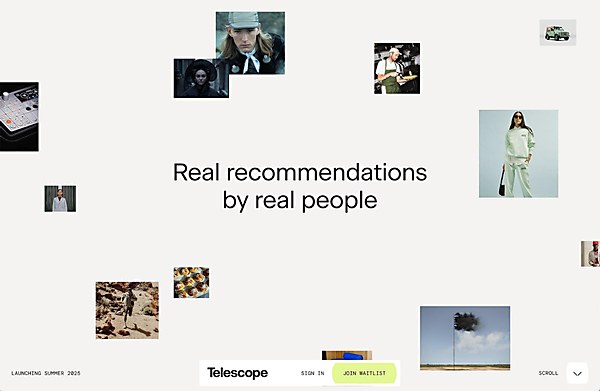
Background: Telescope is a new publishing platform built to connect tastemakers and taste seekers in a more intentional, human way. It’s designed for people with great taste—across food, film, books, travel and music, among others—to curate their recommendations and get paid for sharing what they love. The audience includes culture-curious consumers overwhelmed by infinite options and craving meaningful, personal guidance as well as curators looking for a better tool (and business model) to share their voice.
Design core: The entire site is built around one idea: zooming in on what really matters. That concept drove everything from layout to animation to visual language. We played with depth, perspective and movement to reflect the way Telescope helps users cut through the noise and focus on the best recommendations. The opening cloud of images that gradually zoom into view, the portrait of a curator that duplicates and tunnels inward, and the expanding oblique lines that echo a telescope’s shifting lens—every interaction reinforces that central metaphor. Even the final moment, where images follow the cursor’s position, gives the user agency to explore what draws them in. We’re especially proud of how consistent and expressive the storytelling feels. There’s a lot happening under the hood, but the experience remains smooth, cohesive and human, just like the platform itself.
Challenges: Introducing a new and somewhat complex concept in a way that felt simple, compelling and human. Telescope isn’t just another content platform; it’s part of a broader cultural shift toward real, personal recommendations in a world flooded with AI-generated content. We needed to clearly communicate what Telescope is, what makes it different and what’s in it for the user, all through a smooth, enjoyable experience that invites curiosity and builds trust. Our goal was to make the product feel intentional and warm, not transactional or generic. In many ways, we were going against the grain, and that required restraint, clarity and conviction in both design and messaging.
Navigation structure: Rather than a traditional multipage layout, we opted for a guided, scroll-driven experience: a single-page story designed to unfold with intention. It’s not just about explaining the product; it’s about inviting people into the world of Telescope. The structure flows from introducing the problem to showcasing the curators to explaining how the platform works to a clear call to action to join the waitlist. It was important to keep the focus tight and immersive, echoing the care and selectiveness Telescope stands for. The scrollytelling format let us control pacing, create emotional beats and give each section the space it needed to resonate.
Technology: To create a truly immersive digital experience, we built a single-page storytelling platform using a modern web animation stack. Vue.js provides the reactive foundation for a seamless user journey. The magic of the animations comes from GSAP, which allowed us to choreograph intricate, scroll-driven narratives that connect with our audience. We sculpted unique visual effects using CSS clip-path and masking to create transitions that are distinct to our brand’s visual language. Finally, lightweight Lottie animations bring our brand illustrations to life with fluidity and charm.
Browse Projects
Click on an image to view more from each project