
Discover the work of Robin Erickson. Learn about her creative practices and some of the choices that help her get the most out of the watercolor medium.
By Colleen Smith
Watercolorist Robin Erickson has earned attention and accolades for her cityscape paintings—images that feature reflections of buildings, along with pedestrians and other urban subjects. But her interest, in terms of subject matter, ranges widely from portraits to still life to experimental motifs. The artist’s series of eucalyptus tree paintings, shown here, brings together her appreciation of the plant kingdom (she’s an avid collector of orchids) and her eye for dynamic composition.

“I started painting eucalyptus portraits as a way to take a break from the more rigorous, carefully composed, and detailed reflection paintings,” Erickson says. “With trees, details become less important; the shapes are more free-flowing and loose, offering a relaxing interlude between my reflection paintings.”
These works, which are at once both realistic and seemingly abstracted, present organic images that simultaneously calm and excite the eye.

Erickson has developed a number of working strategies, techniques, and preferences over the years. Here are some of her suggestions for making the most of the watercolor medium, although she notes that every artist has their own style and way of working, “For all these things, you eventually learn what works and what doesn’t,” the San Diego-based artist says.
MIX YOUR COLORS. “I mix all of my colors. I work with a palette of about 10 colors. One of the first watercolor books I read was Making Color Sing by Jeanne Dobie. She recommended mixing colors from three primaries—cobalt blue, cobalt yellow, and a pink [I use quinacridone rose]—to mix all other colors. I add a sienna and a gold to my palette, and a few others that I can’t mix, but, otherwise, I follow this approach.”
PUT COBALT VIOLET TO USE. “I use cobalt violet just about every time I mix a color on my palette. It imparts little color, but it creates a more viscous wash that’s easier to control. Its minerality increases granulation and makes it easier to lift. I add extra blue and yellow to the wash, if necessary, to counteract any shift toward violet.”
SELECT THE BEST BLACK. “I mix my own black from sepia brown and French or ultramarine blue. This makes a black that I can lift and lighten when I need to, whereas other, more permanent blacks can be hard to lift and can leave a residue behind.”
BRUSH UP ON BRUSHES. “I work mostly with sizes 4, 6, and 8. I use only brushes with white bristles so I can be certain they’re really clean after cleanup, which I believe helps me avoid mixing muddy colors.”
KNOW THE IMPORTANCE OF PAPER. “I like the whitest paper I can find. I use Fabriano Artistico Extra White in a very heavy weight, 300-lb., so it doesn’t buckle. I find that a paper with more yellow to it can tone everything I lay onto it. Colors are more vibrant on absolutely white paper. For my eucalyptus paintings, someone gave me a handmade paper from India called Indigo Art Papers and told me they thought my eucalyptus paintings would look great on it. And they do, because the paper has a pebbly texture that works well for the tree bark.”
CONSIDER THE SURFACE. “In terms of paper surface, hot-pressed is my main choice. I sometimes use cold-pressed, but never rough. The hot-pressed paper by Fabriano has a fair amount of sizing, so it lets paint sit on top of the surface. The vibrancy is right there and doesn’t sink in. That has a big effect on edges, and my paintings have a lot of sharp edges.”
CHOOSE A FRAME. “I like metallic frames, generally in a graphite, light gray color. And I prefer wide mats. A 4½ -inch mat all the way around sets off a painting pretty well.”
“I just try to emphasize the curves, the interesting shadows on the trunks, the sometimes magical and unexpected colors, and the general sexiness of the structure.”
—Robin Erickson
To learn more about Robin Erickson and her creative approach to a wide variety of subjects, see the Fall 2025 issue of Watercolor Artist.
About the Artist
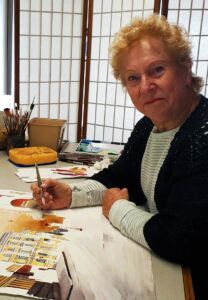
Award-winning artist Robin Erickson, of La Mesa, Calif., fell in love with watercolor painting, eventually leaving a career in mathematical analysis to devote herself full time to her art. She has studied with a number of watercolor luminaries, including Judi Betts, Carla O’Connor, Katherine Chang Liu, Ted Nuttall, and John Salminen. Erickson holds Signature Membership in the American Watercolor Society, National Watercolor Society, and Transparent Watercolor Society of America, among several other groups, and has served as a juror for various art organizations.
About the Author
Colleen Smith is a Denver-based author, creative director, and screenwriter.

